New logo for
(The Swedish Youth Federation for Lesbian, Gay,Bisexual, Transgender and Queer (LGBTQ) Rights)
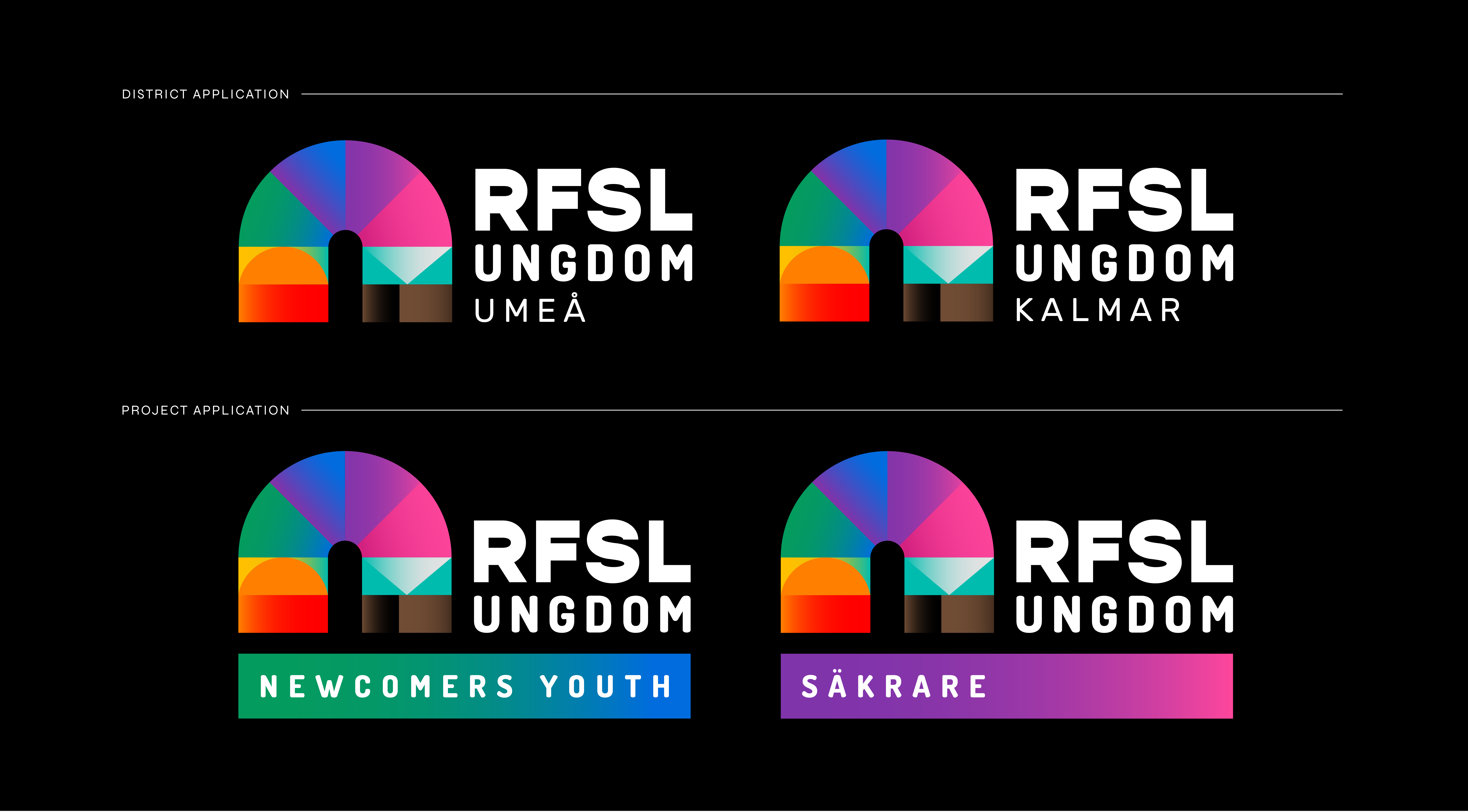
After using the same logo for over 20 years – a variant of the main organization's – RFSL Ungdom wanted something of their own that could live in the digital world. We created a logo that is transformative and fluent in its' expression – to represent all members and visualize the width of the community – while still maintaining its' recognition. It consists of a main symbol that can vary in color and shape depending on the context. For example there are specific lgbtqi+ versions that can be used when communicating with- or when speaking about a subject related to a specific group within the community – as well as abstract versions that can be used on merch, in own channels or in motion versions of the logo.
Besides the new logo the visual identity was also updated with new colors, typography guidelines, illustrations and photo direction.
RFSL Ungdom
(The Swedish Youth Federation for Lesbian, Gay,Bisexual, Transgender and Queer (LGBTQ) Rights)
After using the same logo for over 20 years – a variant of the main organization's – RFSL Ungdom wanted something of their own that could live in the digital world. We created a logo that is transformative and fluent in its' expression – to represent all members and visualize the width of the community – while still maintaining its' recognition. It consists of a main symbol that can vary in color and shape depending on the context. For example there are specific lgbtqi+ versions that can be used when communicating with- or when speaking about a subject related to a specific group within the community – as well as abstract versions that can be used on merch, in own channels or in motion versions of the logo.
Besides the new logo the visual identity was also updated with new colors, typography guidelines, illustrations and photo direction.


